How Photographers Use Colour?
Is it tough for you to settle on a colour scheme when taking photos? An appealing and eye-catching visual impression can be achieved through the strategic use of colour in photography.
A photographer's toolkit typically includes compositional rules of thumb, lighting theory, an understanding of the exposure triangle, and many more resources. And colour is just one of many such tools. Despite its reputation as a potential paralysing factor for photographers, colour may really be used to great effect in establishing a personal style. Like painters, designers, and artists working in other mediums, photographers can benefit from understanding and applying colour theory to their work.
If you need advice on your wedding photography, check out our photography packages and services at Wild Romantic Photography.
Understanding Colour in Photography
If you know how to use colour in photography, your images will be more attractive. To put it another way, this will improve their aesthetic appeal. If you master its application, you'll be able to snap pictures of which you're truly proud. Bright colours and clean composition will increase the likelihood that your images will be purchased. Therefore, colour should be used to its full potential.
DOMINANT COLOURS
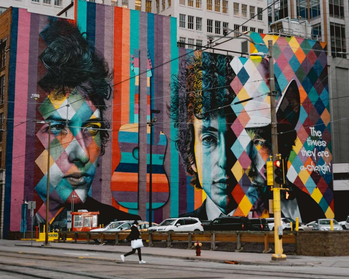
You may have always believed that the key to making an eye-catching photograph was to cram the frame with vibrant colours. Not so. Colours that don't go well together distract the viewer and result in a subpar visual. When there are too many contrasting colours, the eye is distracted by a plethora of visual cues.
If you want the viewer's attention to be drawn to a specific element of the picture, make that element a single colour. Make sure that the colour of your topic is the one that stands out the most. The intensity of the colour determines how much it will stand out. Otherwise, the dominant hue could draw attention away from the main focus and towards a subordinate element.
COLOURS ISOLATION
By far the most important step in producing a dramatic image is isolating colours. Utilising a telephoto or zoom lens will allow you to zero in on a specific area of a scene that stands out owing to a particularly stunning colour or colour combination.
Another way to isolate a colour from its context is to shift your body's position in relation to the source of the light. In order to successfully combine colours, such as those that contrast with one another or those that work well together, you need to come closer to the subject.
ADVANCING COLOURS
Colours towards the warmer end of the spectrum tend to stand out and get our full attention. One may say the hues represent forward movement. Let's use the colour red as an example; it's a daring and powerful hue that, when viewed in a photograph, tends to stand out and take centre stage because of its boldness and richness. You can see how potent red is when there is very little of it in a scene (like a postbox), but it still manages to dominate the whole thing.
The impact of yellows and oranges is similar to that of reds, though it is not nearly as strong. Knowing the state of progressive colours will help you use them to your advantage and avoid having them detract from a picture. Another instance where this might apply is in a wedding scenario if the bride is holding something red. You should keep in mind that it will take the focus off of the bride.
RECEDING COLOURS
That's the exact opposite of how the spectrum of colours works. Their roles are more akin to that of supporting actors in a film cast. They enjoy the environment and add to the atmosphere, making for wonderful images.
As a result, backdrops made of cooler colours like blues and greens are particularly effective. As you get further away, you'll notice that they fade into the background and allow other colours to stand out more. The vast, blue sky and rolling green hills are also present at these times. Excellent images are the result of their careful application.
Warm vs Cool Colours
The two main types of colours are warm and cold. "Warm" colours include red, orange, and yellow, whereas "cool" colours include green, blue, and violet. Asking yourself which of the two categories of colour you are photographing at any given time can help you obtain the greatest outcomes in terms of the overall aesthetic of your images.
Warmer colours evoke stronger reactions because of their increased energy. They practically jump off the screen and catch the reader's interest. Since warm colours are more uncommon than cool ones, pictures with even a hint of warmth can stand out from the crowd. This is partially to blame for the explosion in popularity of images taken at the golden hours of daybreak and sunset and during the changing of the leaves in autumn.
Cooler colours, on the other hand, are those that are more muted and subtle. When paired with a warmer toned colour, they blend in and become less obvious. Even though they don't get as much attention as warm colours, that doesn't make them any less interesting.
Colours that are too warm might be overpowering, whereas those that are too cool can be relaxing. Although most of the natural world is composed of bluish and greenish colours, even the greenest of landscapes can be bathed in golden light during sunrise and dusk.
The six traditional fundamental colours and the emotions that are commonly associated with them (red, orange, yellow, green, blue, and violet).
Trying to capture an emotion in a photograph is far more challenging than it sounds. Simply by switching up the shot's subject or composition, you can make images devoid of the following emotions. The subsequent impacts, however, will be different.
Choosing the right wedding photographer in Melbourne to capture every moment on your wedding day.
Tips For Effective Use of Colour in Photography
The Basics
The three most fundamental colours are red, blue, and yellow. Black is the other option. Mixing these fundamental hues yields secondary hues like green, purple, and orange. Blending blue and yellow, or purple and red, produces green. The next step in colour theory is the tertiary colours, which are formed when secondary colours are combined even further.
The colour wheel is a graphical representation of the relationships between hues. They occupy a range of values along a spectrum, with one colour transforming into the one to its immediate left or right.
Colour Harmony
Color harmony describes colour schemes that are aesthetically pleasant to the human eye. When two or more colours create a pleasing aesthetic when used together, we say that there is "colour harmony." Artists and photographers alike rely significantly on this instrument in order to convey their message to viewers and evoke an emotional response from them.
It is as important to consider how different colours interact with one another as it is to focus on individual hues. There are a seemingly unlimited amount of colour combinations in the actual world, from simple contrasts to complex harmonies. There are certain of these associations that work better than others, although it will take some practise — and often some post-processing — to obtain the exact look you want.
Warm and Cool Colours
Warm and cool colours provide a necessary contrast. Having both types in focus in one image makes for a striking colour contrast that might be the focal point.
Photographs with adjacent colours that are diametrically opposed on the colour wheel have an intrinsic contrast similar to that of works of art that blend black and white.
It's vital to pay attention to the sky since that's where the warm clouds stand out against the frigid backdrop. In the monochrome version of this shot, the top does not stand out as much as it does in the coloured version because there is not a substantial contrast between the two.
Because of the striking contrast in colour, the sky is brought to the viewer's attention, making it a very significant component of the composition. Looking for a Yarra Valley wedding photographer? Look no further! Wild Romantic Photography has you covered.
Complementary Colours and Other Relationships
Some alternate colour schemes, such as one that includes all three primary colours, have been proposed as being visually appealing (red, yellow, and blue). The same is true of pairs of colours that aren't included in the list above, such as yellow-orange or blue-green, which each have their own distinct strengths and benefits.
While I do not entirely deny the idea that more complex colour harmonies are often magnificent and evocative, the truth remains that this discussion has the potential to get rather complicated when three or more colours are being addressed at the same time. Real-life colours are very different from those depicted on canvas. Reality is far messier than a pristine blue-green that blends seamlessly with equal parts of red and orange.
There is no harm in exploring more in-depth conversations on colour harmonies and correlations, and doing so may actually help you learn something new. The most crucial piece of guidance I can give you, though, is to glance around at the scene before you and ask yourself if the colour scheme "looks appropriate." While that may be a highly imprecise statement, it is true that when it comes to photography, following one's gut is more important than trying to capture a perfect image that may not even exist.
The one and only time this is not the case is when editing the photo in post-production, when you have more control over the colours you use. If so, it's time well spent to adjust the photo so that the colours work nicely together, whether that's strictly according to the rules of a colour wheel or more likely just because it looks good to you.
Monochromatic versus Analogous
Though they have similarities, complementary colour schemes and analogous colour schemes are not the same. A monochromatic colour scheme or harmony is one that employs only one colour, with the hue and saturation of that colour serving as the only modifying factors. Colours that are adjacent to one another on the colour wheel form the basis of an analogous colour harmony colour scheme. There is still a dominant colour, but the combination of the two colours is much more pleasing to the eye.
Both of these colour schemes are both easy to implement and visually satisfying when completed. Monochromatic colour schemes are occasionally used to set a mood because of their aesthetic appeal and sense of harmony.
To create a soothing and tranquil mood in your painting, utilise colours that are similar to one another. When you go outside, you get to experience the full spectrum of colour combinations, including these two in particular. Think of the myriad shades of green in a forest, or the flaming reds and oranges of an autumn landscape. It's likely that you find these tones pleasing, and maybe you can see why.
Using colours that are close in hue will help provide peace to your pictures.
The harmony of the colours is beautiful.
Sometimes you want there to be tension in the photographs you capture, but other times you don't. To be sure, there are situations when you don't want a particular feature of your shot to stand out.
As an alternative, you should strive for a cool, collected demeanour at all times.
Using colours that are similar to one another is ideal when representing more muted scenes, such as a group of yellow and green trees in autumn or a blue flower laying alone in a field. As long as the rest of the arrangement is meant to evoke calmness, this lovely sense of peace will be kept thanks to the complementary colour scheme.
Also, don't be reluctant to use a colour scheme that includes three complementary hues. Colour schemes like green, blue, and purple or green, yellow, and blue are excellent choices when you want to make people feel relaxed.
Find colours that are similar to each other if you want your images to have a subdued appearance.
Complementary Colours
Direct opposites on the colour wheel form a complementary pair. In this way, the colour that opposes a main colour is considered to be a secondary colour (as demonstrated by the colour wheel). Red and green, for instance, are complementary because they are so contrasting. When both colours are utilised at their full saturation, the result may be rather striking because each one makes the other seem more energetic.
Use complementary colours to make your images pop. Now that you know the most fundamental tip for using colour in your photography, it's time to dive deeper into exploring specific colour combinations that work.
Colour schemes that feature contrasting hues are really popular; I happen to find them to be the most attractive.
You've planned the wedding of your dreams, and you don't want to miss a thing! Have no fear, you are in good hands with Wild Romantic Photography .
The Key or Dominant Colour
It is common to refer to the colour that is most prominent in an image as the "key colour" of that image. For maximum impact, it's often best to let a single colour stand out. This is especially noticeable when the dominant colour is a primary hue like red, blue, or yellow.
More vibrant colours will draw in (and hold) the attention of your audience. Consider that in light of the implications it has for your topic of study.
Advancing or Receding Colours
The approaching colours are the range of hues found closer to the red end of the spectrum. Included in this group are the hues of red, reddish-violet, yellow, yellow-orange, and orange. When items are depicted with a preponderance of advancing colours, it is as though they are drawing nearer to the viewer. One of the most striking and attention-grabbing colours is red. Think of a scene in which there is barely any red (a red mailbox, for instance) but it stands out dramatically.
Changing from one colour to another can be quite powerful, but it also has the ability to spoil the scene by distracting the viewer's focus from the main subject.
Regressing colours are the polar opposite of foreground colours and are typically connected with the backdrop. Cooler colours like blues and greens can have a dramatic impact on a scene. They fade into the background, adding depth and serving as a contrast to the more front colours.
At Wild Romantic, we have the best wedding photographer in Mornington Peninsula to capture every single moment on your wedding day.
Whenever you are taking a photograph with a specific focus, you should work to ensure that the subject is easily distinguishable from the background.
As an alternative way of putting it, the focus needs to be on the reader or spectator. Your goal is to keep the viewer's attention fixed on the topic of the photo.
Colour theory can help you get this result. As long as your subject stands out from the background, you're good to go.
Pick something colourful as a jumping off point. Whether it's a red flower, blue building, yellow car, or anything else, the colours should be bright and extremely saturated.
Place it in front of a neutral background, preferably one with few colours or none at all, such as white or black.
By using a monochromatic background and contrasting bright colours on your subject, you may focus the viewer's eye directly to your photograph's focal point.
Feelings and Colour
There is a wide range of responses that people have to colour. This is why we frequently employ a range of colours to convey an array of emotions. The expressions "feeling blue," "seeing red," "ticked pink," and "green with envy" all refer to negative emotions.
The chilly blues of morning evoke a different kind of emotional response than the bright colours of sunset do. The use of colour in your photographic compositions should mirror your attitude to color's psychological power in other contexts.
Know that colour is subjective; one person's favourite shade may drive another insane. The hue, saturation, and accompanying colours of a colour can have a significant impact on the emotions it evokes in a viewer. For example, orange can be stimulating when it leans towards red but soothing when it leans towards yellow. That's because orange can change between those two phases.
If you want your colour shots to stand out, you need to be deliberate about how you use colour. Like composition, framing, and technique, it should be given equal weight to ensure that it effectively conveys the tale you intend to convey with your shot.
Experiment with different combinations and play around with colours in post-production to create the mood and balance that best reflects your interpretation of the subject. If you’d like to work with professional photographers for your wedding, book with us at Wild Romantic Photography.
You'll need to use both your analytical and imaginative parts of the brain to make colour photographs so brilliant they seem magical.
Conclusion
A photographer's toolkit typically includes compositional rules of thumb, lighting theory and an understanding of the exposure triangle. Colour may really be used to great effect in establishing a personal style. Like painters, designers, and artists working in other mediums, photographers can benefit from understanding and applying colour theory. Colours towards the warmer end of the spectrum tend to stand out and get our full attention. Knowing the state of progressive colours will help you use them to your advantage.
Since warm colours are more uncommon than cool ones, pictures with even a hint of warmth can stand out from the crowd. The colour wheel is a graphical representation of the relationships between hues, with one colour transforming into the one to its immediate left or right. Mixing these fundamental hues yields secondary hues like green, purple, and orange. The next step in colour theory is the tertiary colours, formed when secondary colours are combined further. Some alternate colour schemes, such as one that includes all three primary colours, have been proposed as being visually appealing.
The most crucial piece of guidance I can give you, though, is to glance around at the scene before you and ask yourself if the colour scheme "looks appropriate". An analogous colour scheme is one that employs only one colour, with the hue and saturation of that colour serving as the only modifying factors. Colours that are adjacent to one another on the colour wheel form the basis of an analogous colour harmony colour scheme. Colour schemes that feature contrasting hues are really popular. Advancing or Receding colours are the range of hues found closer to the red end of the spectrum.
It is common to refer to the colour that is most prominent in an image as the "key colour" of that image. If you are taking a photograph with a specific focus, you should work to ensure that the subject is easily distinguishable from the background. Cooler colours like blues and greens can have a dramatic impact on a scene, adding depth and serving as a contrast to the more front colours. If you want to stand out from the crowd, you need to be deliberate about how you use colour. The hue, saturation, and accompanying colours of a colour can have a significant impact on the emotions it evokes in a viewer. This is why we frequently employ a range of colours to convey an array of emotions.
Content Summary
- An appealing and eye-catching visual impression can be achieved through the strategic use of colour in photography.
- Despite its reputation as a potential paralysing factor for photographers, colour may really be used to great effect in establishing a personal style.
- Understanding Colour in Photography If you know how to use colour in photography, your images will be more attractive.
- Bright colours and clean composition will increase the likelihood that your images will be purchased.
- When there are too many contrasting colours, the eye is distracted by a plethora of visual cues.
- In order to successfully combine colours, such as those that contrast with one another or those that work well together, you need to come closer to the subject.
- Cooler colours, on the other hand, are those that are more muted and subtle.
- Colours that are too warm might be overpowering, whereas those that are too cool can be relaxing.
- Although most of the natural world is composed of bluish and greenish colours, even the greenest of landscapes can be bathed in golden light during sunrise and dusk.
- The colour wheel is a graphical representation of the relationships between hues.
- Colour Harmony Color harmony describes colour schemes that are aesthetically pleasant to the human eye.
- Complementary colours and Other Relationships Some alternate colour schemes, such as one that includes all three primary colours, have been proposed as being visually appealing (red, yellow, and blue).
- Monochromatic colour schemes are occasionally used to set a mood because of their aesthetic appeal and sense of harmony.
- The Key or Dominant colour It is common to refer to the colour that is most prominent in an image as the "key colour" of that image.
- By using a monochromatic background and contrasting bright colours on your subject, you may focus the viewer's eye directly to your photograph's focal point
- Experiment with different combinations and play around with colours in post-production to create the mood and balance that best reflects your interpretation of the subject.